


Introduction
Overview
“Match Dog” is a short, animated commercial for a fictional app that playfully parodies dating apps to match dog owners who want to walk together. This project demonstrates my UX/UI sensibility and motion design skills through polished, humorous, profile-driven storytelling.
Context & Problem
This project was created for my Master’s program as an animation-focused assignment: design and produce a complete animated commercial using dedicated software tools. I chose to build a fictional product—“Match Dog”—because it let me combine familiar mobile UX patterns (profiles, swipes, filters, match moments) with a light narrative and comedic timing, all within a concise ad format.
This project was part of the Motion Across Media course, a graduate course at Quinnipiac University.
Goals & Success Criteria
Because “Match Dog” isn’t a real app, the primary goal was execution quality rather than product validation. Success was defined by:
Strong visual design and UI clarity (readable layouts, consistent components, appealing typography/color).
High-quality animation (smooth transitions, purposeful motion, clean pacing, and timing).
Creative concepting (a coherent, funny premise with a memorable “ad” feel).
A strong outcome is a piece that feels professionally art-directed, communicates the idea instantly, and demonstrates range across design, motion, and storytelling.
Audience
This is a fictional app. In theory, it would appeal to dog owners who want more motivation and social connection during walks. For example, new residents looking for compatibility (dog size/energy level, walking pace, neighborhood, schedule) and those who enjoy playful, personality-driven experiences.
The app’s design skeleton resembles that of dating apps, including filters and profile pages, and is loaded with humor, as allowed in those fictional projects.
Creative Concept
I started by borrowing the visual language and interaction clichés of dating apps, including swipeable profiles, punchy taglines, and “match” moments. Then translated them into a dog-walking context to create instant recognition and comedic contrast. From there, I designed the UI system (components, profile cards, icons, filter chips) and built a motion grammar in After Effects that mimics real product micro-interactions.
The strategy was to treat it like a real commercial: hook fast, explain the premise through UI beats, and land jokes with timing and visual accents. The aim was for it to feel tight and intentional, an ad that’s entertaining first but also a clean portfolio signal of UX/UI polish and animation craft.
Approach
The production of this digital product included three major stages:

Pre-Production
Research
Storyboards
Audio and Tone

Production
llustrations and components
Animations

Post-production
Video editing
Sound design
Rendering and uploading

Stage 1: Pre-production
Framing the Concept and Narrative
During this phase, the project's concept and story were defined, grounded in real user behavior. A storytelling structure balancing familiarity and humor was created, aligning product logic, visual style, and pacing before execution.
Methodology
Conduct research.
Map the narrative through storyboards.
Define the audio and tone direction.
Research
Pre-production began with lightweight research to ground the joke in plausibility, exploring the real need among dog owners for safer, social, motivating walks, especially in cities or for new residents.I translated this into clear reasons for the app: finding compatible walking partners by location, schedule, dog size, energy, and temperament.
Simultaneously, I analyzed dating app structures and UX components, including profile storytelling, swipe-and-match mechanics, filter discovery, and pacing. This helped me decide which patterns to mimic for recognition and where to exaggerate for humor.
Storyboards
Through the storyboards, I outlined a screen plan for home/discovery, dog profiles, match, and chat/meet-up. Additionally, I prepared a narrator “topic list” to keep the script focused on the app's purpose, functionality, humor, uniqueness, and a call to action.
Audio & Tone
I made early decisions on tone and audio: upbeat background music matching dating-app energy; a voiceover with space for on-screen jokes; and sound cues supporting interactions like swipes, matches, and pop-ups without overpowering visuals. This blueprint guided UI design and animation timing.

Stage 2: Production
Bringing the Concept to Life Through Design and Motion
Production translated the concept into a cohesive visual and motion system. All illustrations and components were animated with various techniques to simulate real product interactions and a comedic narrative.
Methodology
Create all illustrations and components.
Execute animation in Adobe After Effects
Illustrations and Components
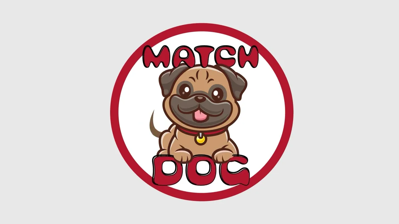
I created all the illustrations and components, including the app logo and screen designs. For example, the logo uses the playful, humorous font "Bubblegum Pop Vanilla" to match the fun, entertaining message in the video. The logo features a cute dog panting and the app name.
All the illustrations were created using separate composition layers in Adobe Illustrator. This approach makes it easier to animate the body parts in the next step.
Animating Components
All animations were created in Adobe After Effects. Each component or illustration developed earlier was animated using different techniques.
Other characters in the video were animated using the "Puppet Pin Tool" to animate the dog's tongues and ears. Additionally, other movement techniques were employed to animate the tails and certain body parts.
The mobile interface was designed using a cellphone image as a mask, enabling the display of various mobile interactions.
Each animated illustration was designed as a composition in After Effects. Afterwards, all these compositions were downloaded individually to make video assembly and editing easier.

Stage 3:
Post-production
Shaping the Final Experience Through Editing and sound
This stage focused on editorial work, layered sound design, and final polishing to ensure every cut, audio cue, and transition felt polished and truly engaging.
Methodology
Conduct video editing
Perform sound design
Render and upload the final video
Video Editing
After downloading each composition, I compiled them in Adobe Premiere Pro. This software streamlines post-production steps, including video editing and sound design.
Sound Design
The audio was built in layers, with many sounds collected. For this commercial video, I added a funny background soundtrack. This helped convey the app's main message with humor and enjoyment.
Throughout the video, ambient sounds like panting and barking dogs helped make the animated dogs feel more realistic. Additionally, cellphone sounds such as swipes, matches, and taps were incorporated. A voice-over was also added to explain the story, direct the viewer, and emphasize the emotional tone.
Rendering and Uploading
The final deliverable was rendered and optimized for short-form digital distribution. The completed piece was uploaded to YouTube.
Iterations & Feedback
During early reviews, the main feedback was about clarity and pacing.
Finding 1:
The narration was lost under the music
Finding 2:
Some humorous on-screen moments were lost due to rapid transitions and didn’t stay on screen long enough to be fully viewed.
Finding 3:
Animation believability. For example, the dog leash on the opening screen felt static and “designed” rather than alive.
Outcome
Here's the video available on the YouTube platform:
Reflections and Next Steps
This project highlighted how motion shapes product understanding. Creating a commercial forced me to communicate value quickly, honing my skills in hierarchy, pacing, and narrative clarity. These skills directly apply to UX/UI design when creating onboarding flows, empty states, feature education, and moments of delight. It also made me more intentional about timing: when to accelerate for energy, slow down for comprehension, and use motion to guide attention rather than just decorate.
It also gave me a concrete way to express my design DNA. The humor isn’t just in the script. It’s embedded in the interaction patterns and the visual details that reward a second look. I leaned into my love of detail by treating each screen like a real product surface: consistent components, readable typography, strong layout rhythm, and memorable transitions that feel cohesive rather than random.
Looking ahead, I want motion to be a core part of how I design products, not a finishing layer. My next steps are to explore more advanced motion systems and deepen my understanding of how to incorporate them into digital products. I’m excited to continue building prototypes that unite UX strategy with expressive, purposeful motion and to pursue opportunities where storytelling, interaction design, and animation come together to create memorable experiences.
